

The Operations Console
The Tickets console tells you about one ticket at a time. The Operations Console tells you about the whole pipeline: are tickets closing faster than they arrive, which stage is holding work up and since when, which stages keep bouncing tickets back, and whether the virtual workers staffing the queue are running. After this page you will be able to read every chart on the Overview, spot a stall the day it starts, build and share a dashboard of your own, and inspect a workflow as a graph.
The console is part of the help desk and is available to staff whose role lets them work tickets. Who can work tickets is set by your roles and permissions.
Finding the Console
Open Tickets from your sidebar. The sidebar switches to the Tickets menu, with four entries: Overview, Dashboards, Workflows, and Ticket Queue. Opening Tickets lands you on the Overview. The Ticket Queue is the console where you work individual tickets, described in The Tickets Console; select Back to App at the top of the menu to return to your usual sidebar.
The Overview at a Glance
After this section you will be able to set the Overview to the slice of work you care about and read its headline numbers.
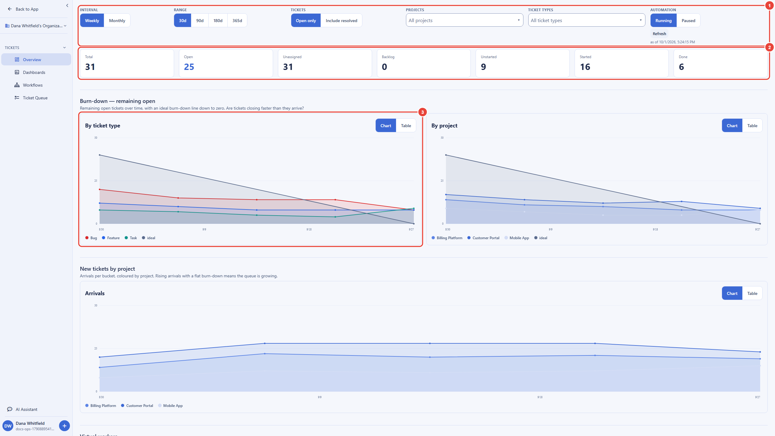
The control bar at the top applies to every chart on the page:
| Control | What it does |
|---|---|
| Interval | Weekly or Monthly: how the history is bucketed along each chart. |
| Range | How far back the charts reach: 30, 90, 180 or 365 days. |
| Tickets | Open only, or Include resolved to count finished work as well. |
| Projects and Ticket types | Searchable multi-select filters. Leave them empty for everything, or pick the projects and types you own. A series keeps its color when you filter, so a line you have learned to recognize stays recognizable. |
| Refresh | Reloads the figures. The time beside it says when the figures you are looking at were produced. |
The headline row counts tickets as they stand right now. Total is every ticket in the slice, Open is everything not yet done or canceled, and Unassigned is everything nobody owns yet. The remaining tiles split the work by status: Backlog, Unstarted, Started, and Done. Each state in your workflow belongs to one of these statuses (for example Triage counts as Unstarted and In Progress as Started), so the row reads the same whatever you named your states.
Reading the Burn-Down and Arrivals
After this section you will be able to tell whether the queue is shrinking or growing, and which projects or types are driving it. The Burn-down section draws the open tickets over the range twice: once By ticket type and once By project. The dark straight line is the ideal: steady progress from where the range started down to zero. A series running under the ideal is ahead of pace; one flattening above it is falling behind.
New tickets by project shows arrivals per bucket. Read it next to the burn-down: rising arrivals with a flat burn-down means work is coming in faster than it closes, so the queue is growing even if the team is busy. Every chart tile has a Chart and Table switch; Table shows the same numbers as rows when you need exact values or want to copy them into a report.
Finding a Stall
After this section you will be able to see which workflow stage is holding work up, and when it started. The Stall diagnostic stacks one band per open workflow state, in pipeline order from the bottom up. When work flows, every band stays roughly even or shrinks. When a stage stops draining, its band swells while the stages before it keep feeding it, and the point where the band starts to grow is the day the stall began.
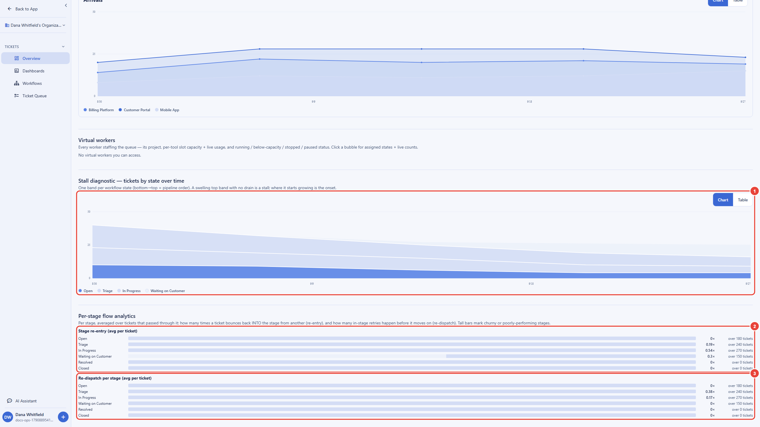
In the example above, the lower bands shrink steadily while Waiting on Customer grows from mid-September: tickets are being handed to customers and not coming back. The fix is a process one (follow-up reminders, or an SLA on that state, see Types, Workflows & SLAs), and the diagnostic tells you exactly where to apply it.
Per-Stage Flow: Re-Entry and Re-Dispatch
After this section you will be able to find the stages that churn. A healthy ticket passes through each stage once. Per-stage flow analytics measures how far your pipeline is from that, per stage, averaged over every ticket that passed through the stage in the selected range:
- Stage re-entry (avg per ticket) counts how often a ticket comes back into the stage from another one. A high value means work is being returned, for example a fix that fails review and goes back to In Progress.
- Re-dispatch per stage (avg per ticket) counts how often a ticket is assigned or handed out while it stays in the stage, before it moves on. Every hand-out counts, including the first, so compare stages with each other: a stage well above the rest is one where work keeps being handed out again because the first attempt does not stick.
Each bar shows its average (for example 0.54×) and how many tickets it is averaged over, so a high value from a handful of tickets reads differently from the same value over hundreds. The longest bar marks the stage to look at first.
Virtual Workers on the Queue
After this section you will be able to check that the workers staffing your pipeline are running and have capacity. When virtual workers staff your workflow, the Virtual workers section shows one bubble per worker you can access: its project, how many of each AI tool's slots are in use out of its capacity, and a status shown as a color, an icon and a word together: running, degraded (running below capacity), stopped, or paused. A paused worker is shown neutral, not as a fault, because you chose to pause it.
Select a bubble to open its details: the capacity of each tool, the workflow states the worker is assigned to with a live count of tickets in each, a Pause or Resume button, and Open worker to go to the worker's own page. Pausing a worker here needs the same permission as managing virtual workers. With no workers staffing the queue, the section says so.
Building a Dashboard
After this section you will be able to save the views you check every week and share them with your team. The Overview is the same for everyone. Dashboards are yours: each is a named page of widgets, every widget built from a ticket filter.
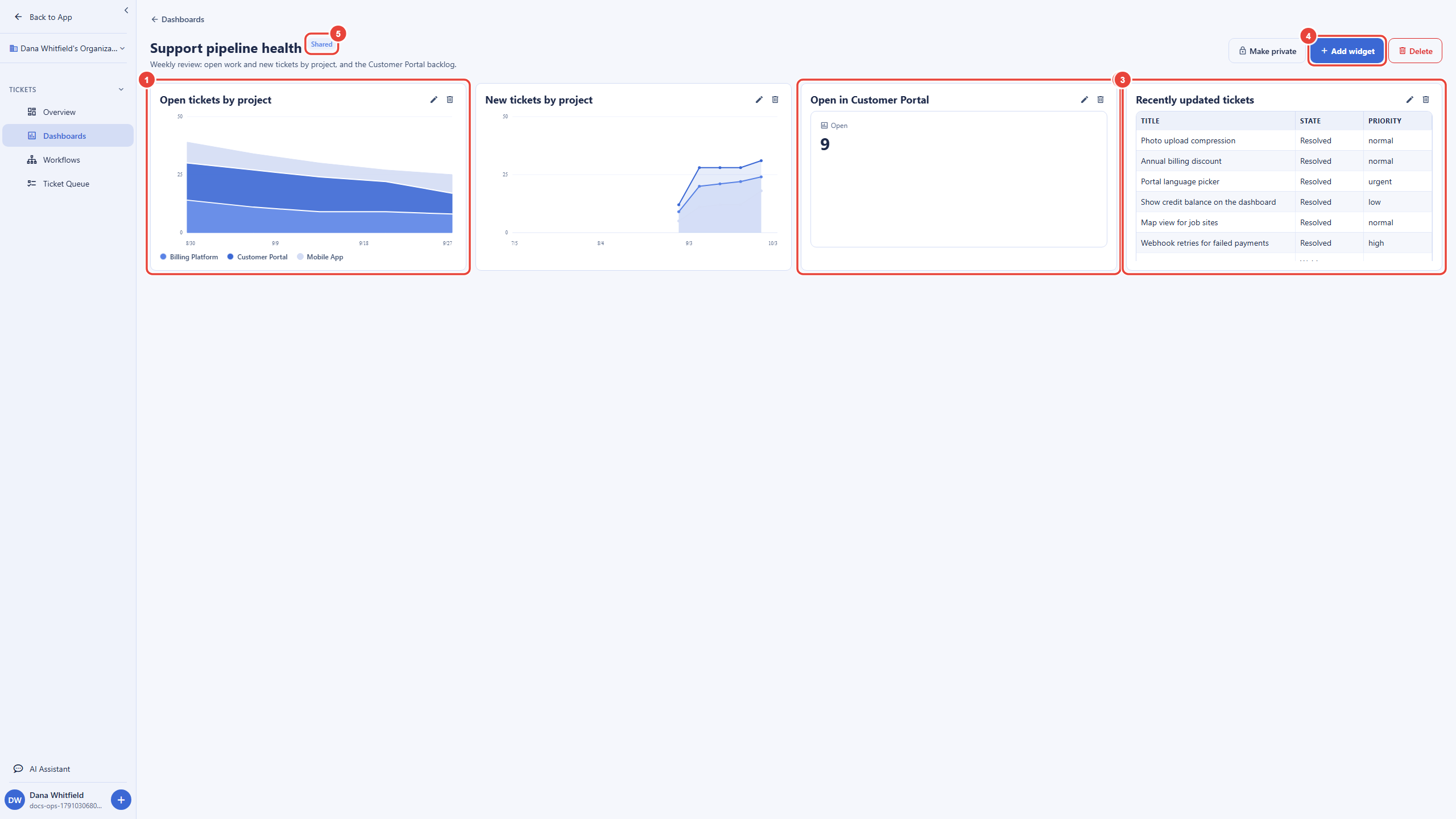
- Open Dashboards and create a new dashboard. Give it a Name and an optional Description, and choose its Visibility: private to you, or shared with everyone in your organization.
- Add widgets. Each widget has a Title, a
Filter (built the same way as a filter in the Ticket Queue), and
a Widget type:
- Chart: a Line or Stacked area chart over the last 90 days, bucketed Daily, Weekly or Monthly. A chart shows open tickets grouped by project, by ticket type or by workflow state, or new tickets (arrivals) by project.
- Stat: one number, such as the tickets open in one project.
- Table: the tickets themselves, the 25 most recently updated that match the filter. Choose its Columns from Title, Status, Priority, Assignee, Updated, Created, State, and Requester (at least one); select a row to open that ticket in the Ticket Queue.
- Save. The dashboard opens the same way next time, with fresh numbers.
To see the individual tickets behind a number, add a Table widget with the same filter, or filter the Ticket Queue the same way (see The Tickets Console).
A shared dashboard appears in the Dashboards list of everyone in your organization who can work tickets, and they can read it but not change it: only the person who created a dashboard can edit or delete it. A private dashboard is visible only to you.
Seeing a Workflow as a Graph
After this section you will be able to check a workflow's shape before you change it. Workflows draws a ticket workflow as a graph. Pick a workflow from the Workflow selector: its states are laid out from the start at the top, in pipeline order, with an arrow for each step a ticket can take between them. For a state staffed by a virtual worker, expand the state to see the steps the worker's skill goes through and, from each one, which ticket moves it is allowed to make; select a step to see the detail in a side panel. Use Expand all and Collapse all for a large workflow, and the zoom controls to fit the graph on screen.
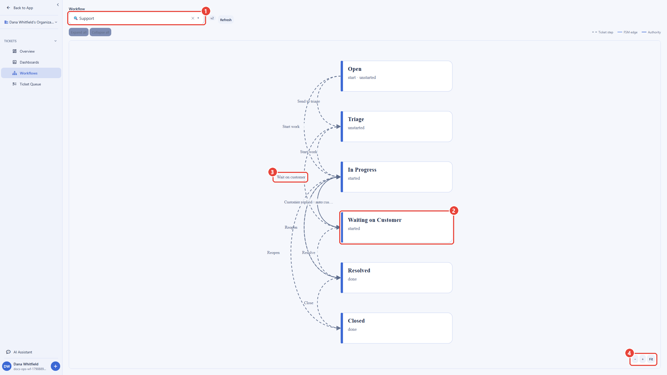
The graph is read-only: you change a workflow in the help desk settings (see Administration and Types, Workflows & SLAs), and the graph shows the result.
How Fresh the Numbers Are
The headline row is live. The charts are built from a daily record of your tickets: each day the number of tickets in every state, project and type, the arrivals and completions, and the per-stage flow are recorded, so a 365-day chart loads as fast as a 30-day one. Today's figures are brought up to date on top of that record. When the console shows a stale badge beside Refresh, today's figures are not yet up to date, and the history before today is unaffected. A ticket moved to another project or type is counted under its new project or type from the day it moved.
Frequently Asked Questions
- Who can see the Operations Console?
- Staff whose role lets them work tickets. People who only file tickets never see it.
- Do I have to set anything up?
- No. The console reads the tickets, workflows and virtual workers you already have.
- Can I see only my team's work?
- Yes. Filter the Overview by project and ticket type, or build a dashboard whose widgets filter to your team's projects and save it.
- What is the difference between re-entry and re-dispatch?
- Re-entry is a ticket coming back into a stage from another stage, and should be close to zero in a smooth pipeline. Re-dispatch counts every time a ticket is handed out while it sits in a stage, so compare stages with each other: the one well above the rest is where work keeps restarting.
- Can someone else change my shared dashboard?
- No. Everyone you share it with can read it; only you can edit or delete it.
- Can I get the numbers out?
- Switch any chart tile to Table to read the exact values. To export tickets themselves, use the Ticket Queue's export, see The Tickets Console.
Related
- The Tickets Console: work the queue ticket by ticket
- Types, Workflows & SLAs: design the workflow the console measures
- AI Support: virtual workers that staff your workflow
- Virtual Workers: hire and manage the workers shown on the Overview