

Themes & White-Label Branding
Theme Studio is where you define what your product looks like. You set your colors, typography, and layout once, in one place, and every screen renders from that single source of truth. The same system lets each of your customers layer their own brand on top, so one product can serve many fully white-label experiences without a code change.
Pro Theme Studio, white-label branding, and multi-tenant theming are part of the Backbuild Pro build-and-ship platform. See pricing.
This page teaches the whole model, in the order you will actually use it: get to a first branded screen in minutes, understand the token system a designer signs off on, prove that the white-label is total, edit safely, and then run many brands at scale. If you are wiring a theme onto a packaged product, read this together with Branding & Themes in the SaaS Builder section, which covers how a theme attaches to a package and reaches your apps.
Your First Branded Screen
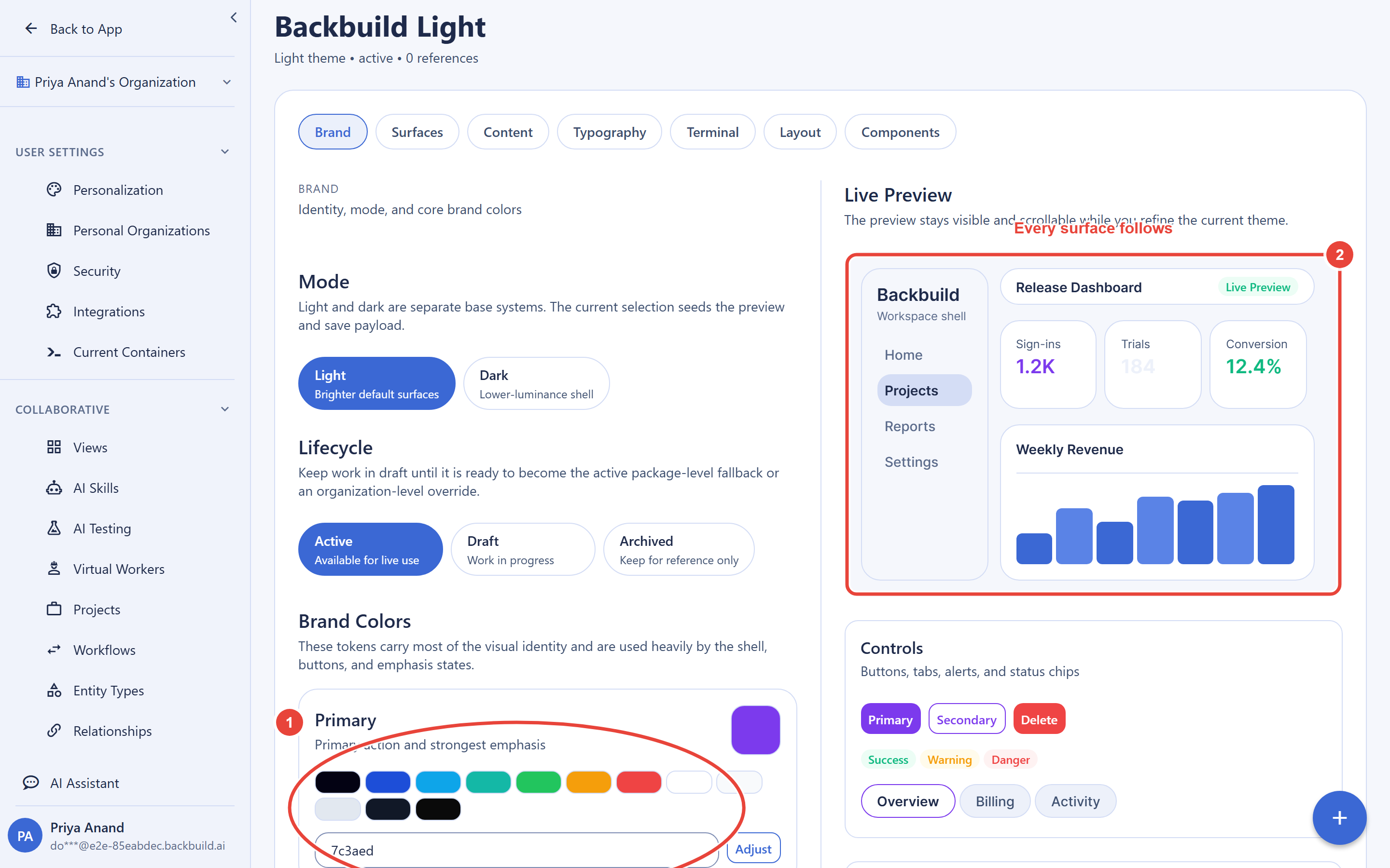
After this section you will have a product that shows your logo, your name, and your brand color, applied everywhere. You do not need a design-system project to get there. Open Theme Studio from your organization settings (the Theme Studio item in the settings sidebar), and set three things:
- Your brand color. Set the
primarycolor role. This is the accent that appears on buttons, links, active states, and highlights across the whole product. - Your logo. Point the logo at a hosted image (an HTTPS URL to an SVG or PNG). It appears in the app header and on the sign-in screen.
- Your product name. Set the app name. It shows in the header, on the sign-in page, and in the browser tab.
Changes preview live as you make them, and when you save, they are served to your running product through its app configuration, so they propagate right away with nothing to rebuild. That is the core promise of the system: you change branding in one place and it cascades to every surface, instead of hunting through per-screen styles.
How fast is this really? Minutes. Set the primary color, logo, and app name, save, and reload your product. There is no build step and no deploy to wait on.
Which plan do I need? Theme Studio and white-label branding are on the Pro plan and up. Containers and sandboxes are separate and run on usage credits. See pricing.
The Theme Model: Roles, Not Scattered Colors
After this section you will know exactly which properties are
themeable and why one edit updates every screen that uses it. A
theme is a set of design tokens grouped into colors, typography, and layout.
The important idea is that colors are named by their role in the
interface, not by their value. You set the primary role once;
every button, link, and active state that reads primary updates
together. You never chase a hex value across dozens of screens, and when two
screens look slightly different you have one place to inspect rather than
scattered overrides.
Color roles
A theme defines ten color roles. These are the semantic names the product renders from:
| Role | What it colors |
|---|---|
primary | Your main brand color: primary buttons, links, active and selected states. |
secondary | A supporting color for secondary actions and muted interactive elements. |
accent | A highlight color for emphasis, badges, and callouts. |
background | The base page background. |
card | The surface color for cards, panels, and raised containers sitting on the background. |
text | The primary text color used for body and headings. |
border | Dividers, input outlines, and container borders. |
success | Positive status: confirmations and healthy states. |
warning | Cautionary status: warnings and attention states. |
danger | Negative status: errors and destructive actions. |
Two naming details matter when you map your brand guide onto these roles.
The negative-status role is named danger, not
error. There is no separate info role: use
accent or secondary for informational emphasis.
Getting the role names right is what makes a single edit cascade correctly.
Typography
Typography is controlled by four values, and the full type scale is derived for you from the base size, so you set one number instead of hand-tuning a ladder of sizes:
| Property | Meaning |
|---|---|
font_family | The font stack used across the product. |
base_size | The base body size in pixels (10 to 32). The heading and small-text scale is derived from this. |
heading_weight | The font weight applied to headings, for example 700. |
line_height_ratio | The line-height multiplier for readable text (a number between 1 and 3, typically around 1.5). |
Layout
Layout tokens set the structural feel of the product using named steps, so the whole interface stays consistent:
| Property | Values |
|---|---|
border_radius | none, sm, md, lg, or full: how rounded corners are, from square to pill. |
density | compact, comfortable, or spacious: how much breathing room the layout uses. |
sidebar_position | left or right: which side the navigation sits on. |
Beyond these structured tokens, a theme can carry extended sections for finer control (spacing, radius values, shadows, and branding fields such as logo, favicon, and app name). Those live under the theme's extended data and are documented in the Themes API reference.
How many color tokens do I need? Ten named roles cover the interface. You do not build your own token taxonomy; you map your brand palette onto the roles above.
Should I name tokens by role or by value? By role. That is the point of the model: primary is a role, so changing it updates every element that renders from it. A value-based name (a specific blue) would leave you editing every screen by hand.
If two screens differ, how do I trace it? Every surface reads from the same shared roles, so there is a single source of truth to inspect instead of per-screen styles to reconcile.
Light and Dark
After this section you will be able to ship a polished dark mode without maintaining two hand-tuned themes. Light and dark are two resolutions of the same roles: the token names stay the same, and each theme resolves them to the values that fit that mode. A theme is marked light or dark, and your product picks the matching one, so you author the palette once per mode and let the roles do the rest.
You preview both light and dark in Theme Studio before you publish, which is
also where you confirm legibility. Because text and
background are explicit roles, you can check text-on-background
contrast in each mode and adjust a single role until it reads cleanly,
rather than discovering a low-contrast combination on a live screen. When
you build on top of a default theme, you only override the roles that differ
from it, so a small brand change stays small.
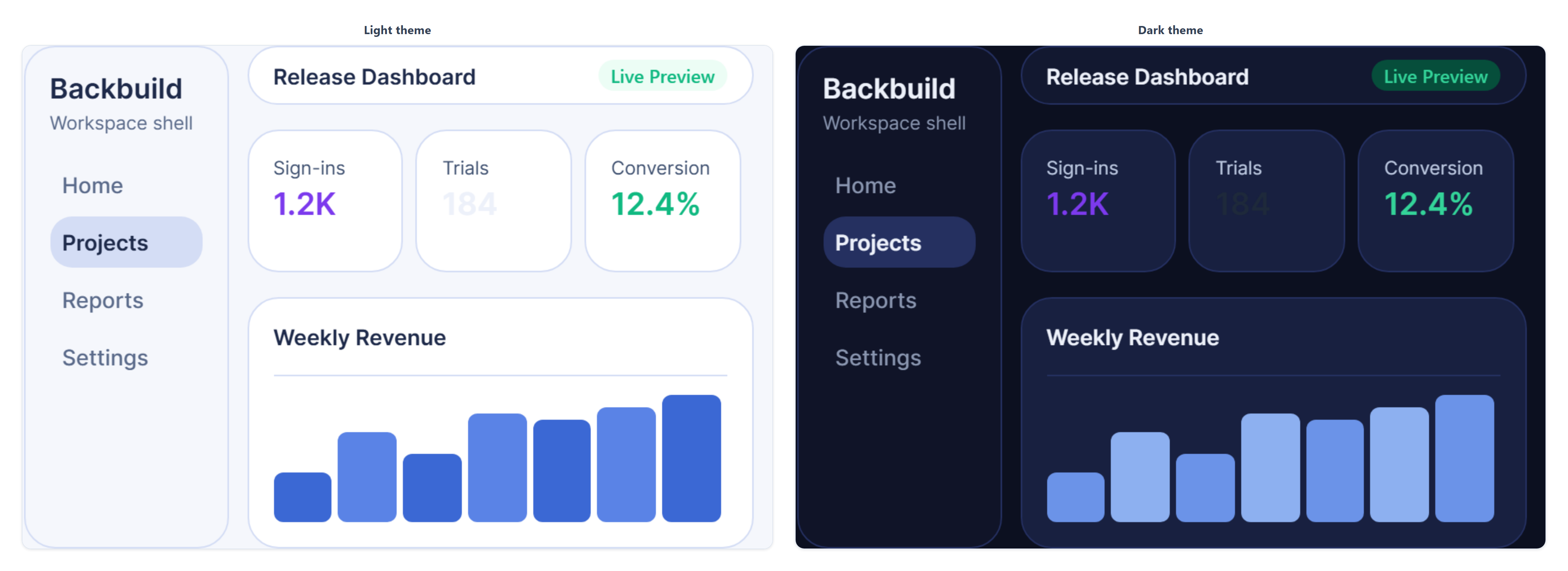
Do I maintain two separate themes for dark mode? No. Dark mode resolves the same roles to dark-appropriate values. You preview both before publishing and only override what differs.
How do I keep contrast passing if a brand color is harsh? Preview text-on-background in both modes in Theme Studio and adjust the text, background, or primary role until it reads clearly, before you publish.
Complete White-Label: Every Surface Carries the Brand
After this section you will be able to confirm, and show a reviewer, that the product presents entirely as your brand with no vendor marks left over. The most common fear with white-label platforms is a vendor logo or name leaking into a corner nobody checked. Theme Studio drives the brand across the surfaces that carry identity:
- App name in the header, on the sign-in screen, and in the browser tab title.
- Logo in the app chrome and on the sign-in page.
- Favicon in the browser tab and bookmarks.
- Color roles across every screen: navigation, buttons, links, cards, status states, and forms.
- Typography and layout across all content, so the whole product reads as one designed system.
- Loading, empty, and error states, which render from the same roles as everything else, so they carry the brand too.
The reliable way to verify white-label completeness is to experience it as your customer would: sign in to the product as a user of the branded tenant and walk every screen, including the sign-in page, a loading state, an empty state, and an error state. Because all of them render from your theme, a correctly authored theme leaves no vendor branding to find. This is the check a brand-governance or security reviewer runs during vendor approval, and it is exactly the walkthrough this system is built to pass.
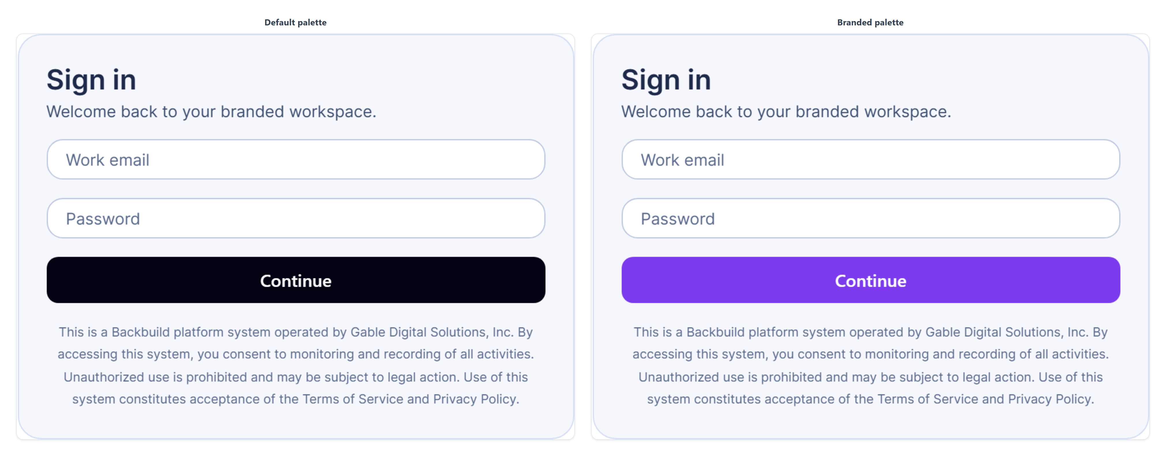
Is this actually total white-label, or does the vendor leak somewhere? Every identity-bearing surface, including the sign-in page and loading, empty, and error states, renders from your theme. Verify it by signing in as your customer and walking each screen.
Which surfaces are customizable and which are fixed? The list above is what a theme controls. Layout structure follows the layout tokens; the content of your product is yours. There is no surface that renders a vendor brand once a theme is applied.
Editing Safely: Draft, Publish, Archive, Restore
After this section you will treat theming as reversible, not as a one-way door. A theme has a clear lifecycle so you can iterate without risk to a live product:
- Draft: a theme you are still building. You can preview it fully before anyone else sees it.
- Active: a theme that is in use by your product.
- Archived: a theme you have retired. Archiving takes a theme out of rotation while keeping it available to bring back.
Every theme shows how many products or tenants currently reference it, so you always know what a change will affect before you make it. Two guardrails protect you from breaking a live product by mistake: your default theme cannot be archived while it is the default (reassign the default first), and a theme that is currently in use is protected from removal. To retire a look, archive it rather than delete it; the archived theme stays available, so restoring a previous appearance is straightforward. Because theme state is also captured in release snapshots (see below), you can roll a product back to an earlier visual configuration wholesale.
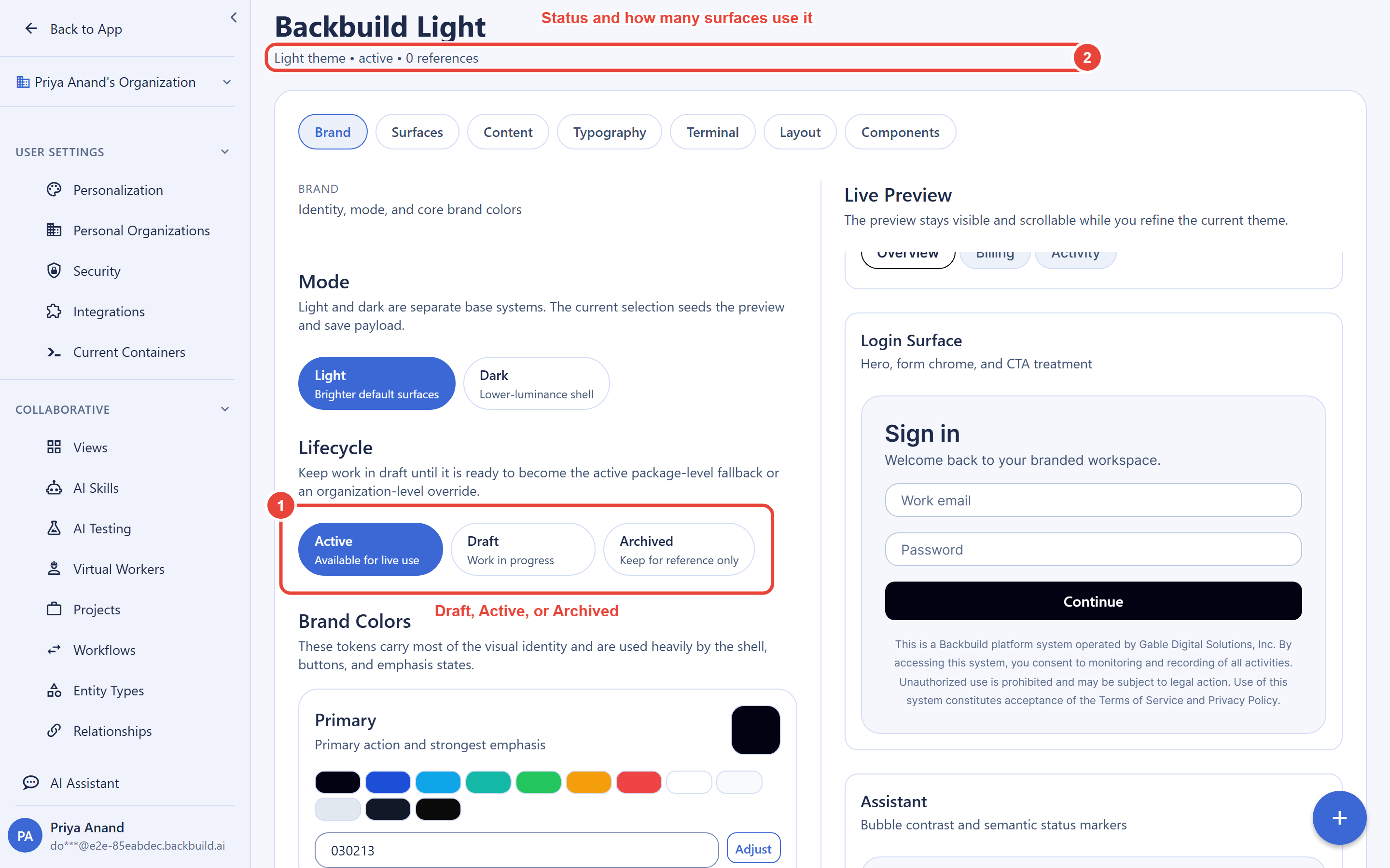
Can I edit a theme live without breaking the product? Yes. Changes preview before you publish, and the usage count tells you what a live theme is attached to before you touch it.
Can I revert? Yes. Archive rather than delete to retire a look, and use release snapshots to roll a product back to an earlier visual state.
Multi-Brand at Scale: Base Theme Plus Per-Tenant Overrides
After this section you will be able to stand up a new branded tenant quickly and repeatably, giving each customer their own look without forking a theme per client. Branding resolves in three layers, and each layer only sets what it needs to:
- System default: the platform's built-in theme, a sensible starting point for every property.
- Package theme: your product's base theme, the look every tenant sees by default.
- Tenant overrides: each customer's own changes on top of your base, for example their primary color and logo.
At render time the app merges the three layers and the most specific one that sets a property wins. Crucially, a tenant override stores only the properties that differ from your base theme, not a full copy. That means when you improve your base theme, every tenant who did not override that property inherits the improvement automatically. You never maintain a hand-forked theme per client.
| Layer | Sets primary color | Resolved for this tenant |
|---|---|---|
| System default | #3b82f6 | base value |
| Package theme | #1a56db | overrides the default |
| Tenant override | #7c3aed | #7c3aed (final) |
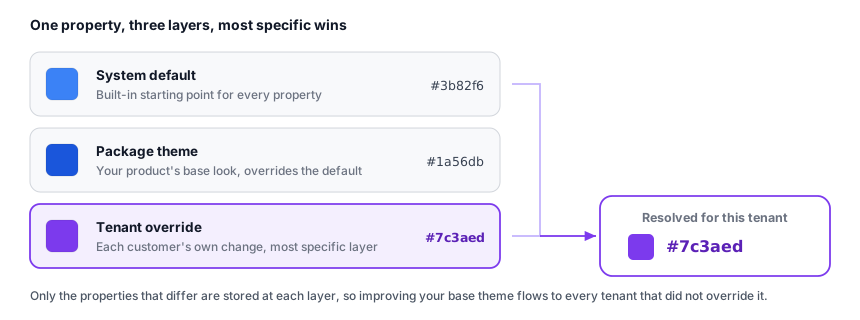
As the product owner you control which properties a tenant may customize, so you can offer, for example, logo and primary color while keeping the rest of the design fixed. Each custom domain resolves to its own tenant's theme, so a single product serves many branded sign-in experiences, each at the customer's own domain and look. See Custom Domains for how a domain maps to a tenant.
Do overrides store only the difference, or do I fork the whole theme? Only the difference. A tenant override records the keys that differ from your base, so base improvements propagate to every tenant that did not override them.
Can I control what a client is allowed to change? Yes. You set the base and choose which properties tenants may override.
Can each brand live on its own domain? Yes. A custom domain resolves to that tenant's theme, so customers see their own brand at their own domain.
Tenant Isolation
Each tenant's branding and data are its own. One tenant can never see another tenant's theme, logo, or data: a request that reaches across the tenant boundary is simply treated as not found. This isolation is the same boundary that protects every organization's data on the platform, so multi-brand deployments do not trade safety for convenience. See Organizations & Teams for the tenant model.
Rolling Out and Rolling Back
Theme state is captured in release snapshots alongside the rest of your product's configuration. That means a visual change ships the same way any other change does, and if a rollout is not right, you restore the prior snapshot to return the product to its earlier look. This gives you staged, reversible visual rollouts rather than a live edit you cannot take back. See Release Management for how snapshots, promotion, and rollback work.
Where Themes Fit in the SaaS Builder
A theme becomes your product's identity when it is attached to a SaaS package, the distributable product you build, price, and sell. The resolved theme, with any tenant overrides already merged in, is served to your apps through their public app configuration, so an app renders the right identity from the first paint with nothing hard-coded. The Branding & Themes page covers that wiring in depth: how a theme attaches to a package, how native app icon and splash assets are set, and how updates reach running apps. See also App Configurations.
Plans and Limits
Theme Studio, white-label branding, and multi-brand or multi-tenant theming are available on the Pro plan and up. Availability of the SaaS Builder, release management, and multi-tenant capabilities, along with how many teams, tenants, and seats each plan includes, is defined on the pricing page, which is the authoritative source for current limits. This page does not restate those numbers so that the pricing page stays the single place they live.
API Reference
Everything Theme Studio does is also available through the themes endpoints, so you can create and manage themes programmatically or from your own tooling. The organization is taken from your authenticated session.
| Method & path | Description |
|---|---|
GET /v1/themes | List your organization's themes, each with its usage count. |
GET /v1/themes/:id | Get a single theme. |
POST /v1/themes | Create a theme. Returns 201 with the full record. |
PUT /v1/themes/:id | Update a theme. Only the sections you send change. |
DELETE /v1/themes/:id | Delete a theme. A theme that is currently in use or set as the default is protected: archive it or reassign the default first. |
On create you provide either the structured
colors, typography, and layout fields
together, or a full theme_data object. You do not set the
theme's key: it is generated by the server, so any key you send is ignored.
# Create a theme with the structured fields
curl -X POST https://api.backbuild.ai/v1/themes \
  -H "Authorization: Bearer $TOKEN" \
  -H "Content-Type: application/json" \
  -d '{
    "name": "Corporate Blue",
    "description": "Brand theme for our flagship product",
    "is_dark": false,
    "is_default": true,
    "status": "active",
    "colors": {
      "primary": "#1a56db",
      "secondary": "#6b7280",
      "accent": "#3b82f6",
      "background": "#ffffff",
      "card": "#f9fafb",
      "text": "#111827",
      "border": "#e5e7eb",
      "success": "#10b981",
      "warning": "#f59e0b",
      "danger": "#ef4444"
    },
    "typography": {
      "font_family": "Inter, system-ui, sans-serif",
      "base_size": 16,
      "heading_weight": "700",
      "line_height_ratio": 1.5
    },
    "layout": {
      "border_radius": "md",
      "density": "comfortable",
      "sidebar_position": "left"
    },
    "theme_data": {
      "branding": {
        "logo_url": "https://assets.example.com/logo.svg",
        "favicon_url": "https://assets.example.com/favicon.ico",
        "app_name": "Acme Build"
      }
    }
  }'
See the Themes API for the complete request
and response shapes, extended theme_data sections, and response
codes.
Common Questions
Is white-label gated behind a sales call? No. It is on the Pro plan, which you can start yourself. See pricing.
Can one product serve many brands? Yes. One package plus per-tenant overrides gives every customer their own logo, colors, and app name, each on their own domain.
Is a theme edit safe to make on a live product? Yes. Preview before publishing, watch the usage count, archive rather than delete to retire a look, and roll back with release snapshots.
How many themes or tenants does my plan include? See the pricing page, which is the authoritative source for plan limits.